Dashboard
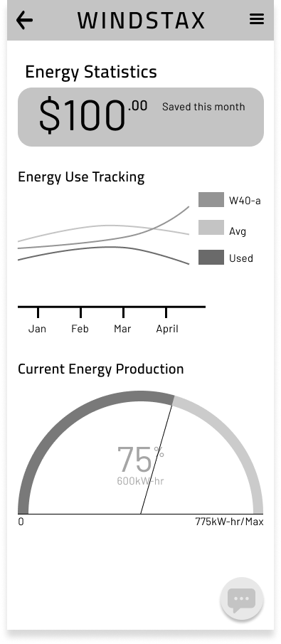
Windstaxx is a local Pittsburgh company that sells Vertical Axis Wind Turbines. To help owners better understand the value of their wind turbines, and encourage the purchase of additional turbines my team created an app. Within the team I owned and developed the dashboard- where owners can see the metrics regarding their turbines. We wanted to show metrics of money saved and energy produced.


Final Design
Users are presented up front with money saved that month.
They can view a graph of money saved where they toggle between different time periods.
Users can see overall energy production vs consumption, with the ability to chose a time period.
Owners can switch between overall energy production, to individual turbine energy production.
Call to action at the bottom to purchase a new turbine.
In the individual turbine view, owners can see the current energy production of the wind turbine.
If there are issues with a turbine there is an alert, and this is emphasized with the use of color. User are directed to the report center to troubleshoot.
Color
For the gauge in particular, I tried several two different styles and several different color schemes, before settling on the bottom left. This one had the best readability, and the affordance of the colors was straightforward.


