Workdom
Creating a Better Customer Experience
Problem
Workdom is a startup that offers consulting services to other companies. They offer a variety of customized services including:
website design
marketing
SEO, etc.
As a new company they are still developing their resources, tools, and marketing materials.
My Role
At Workdom my role was to help the company develop their marketing materials and strategy, in addition to building out the admin-facing side of their app.

Usability
Admin Facing App
When I joined Workdom, only the desktop version on the admin side had been built out. I used the user mobile app and the existing admin desktop app and style guide as a reference for designing these screens in Sketch.
Design Process
Sketches to decide what layout would be best for mobile. This was important to take the large amount information on the desktop and make it digestible for a smaller screen.
From there I moved to wireframes designed in Sketch. Using the other parts of the app as a style guide, I built the screens out first in mid fidelity, before moving into high fidelity using the pre-existing color scheme.
Once the screens were finished I worked with our developer to deploy and subsequently QA and test the admin mobile app.
Additionally, I created new tools and pages for the admin facing app (that did not previously exist in the desktop version). I created several variations of designs for the new tools and then worked with my team to pick what worked best.
Takeaways: This was a great exercise in building out screens from an existing design system, not only for existing features but new ones as well.

Marketing
Website Templates
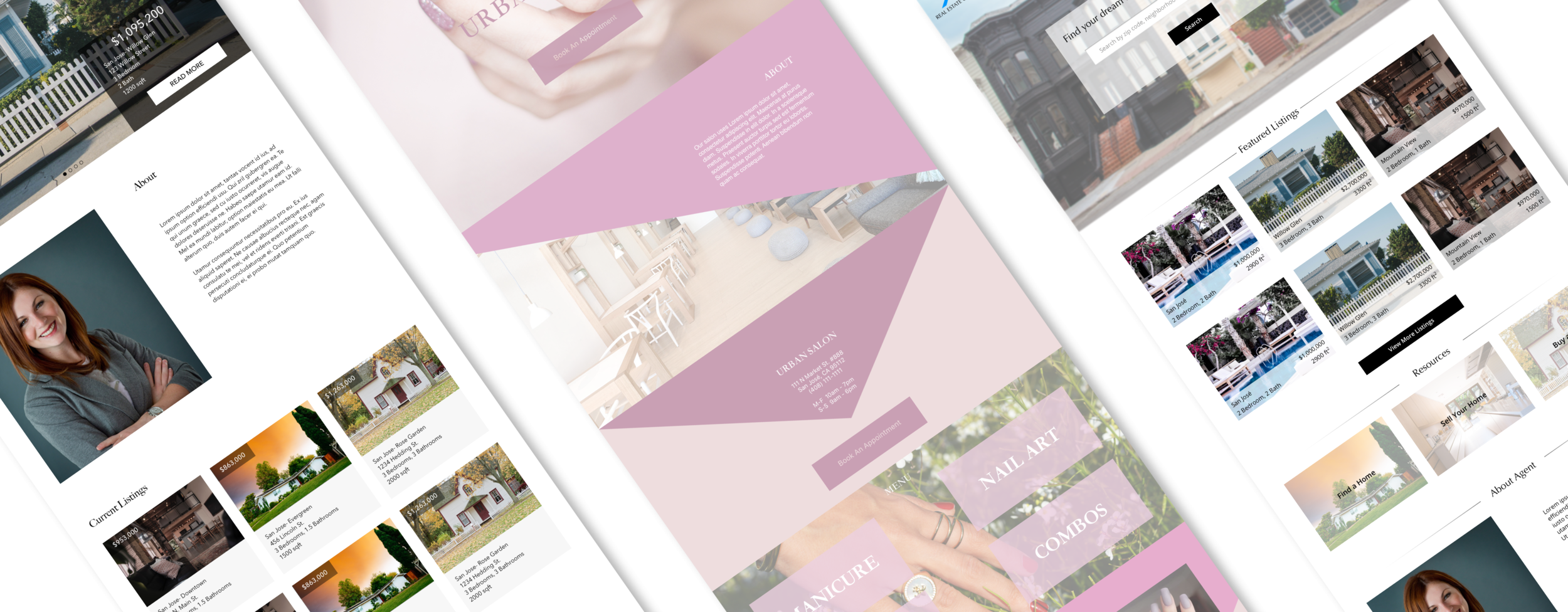
One of Workdom’s consulting services offered is the creation of new websites. To help with marketing, I was tasked with creating several sample homepage templates for different verticals.
Design Process
The first step was to do extensive research into the hierarchy of information displayed and how websites are typically design in these verticals.
After breaking down the components of these website, I moved to sketching. I drew layouts based on what I had identified as important elements from my research.
From there I made higher fidelity design in Sketch. Based on feedback from my team I made some edits before handing them off.
Takeaways: I learned a lot about the importance of layout, content and aesthetic, and how this varies industry to industry.
Marketing Materials
At this time members of Workdom were attending conferences and actively seeking new clients. They were trying to better understand their target customers and the customer journey, while spreading awareness of their business and finding new clients.
Persona and Customer Journey
Prior to my onboarding at Workdom, they had conducted several interviews with a variety of business owners from a wide array of verticals. I read through these and synthesized these into two personas based on similarities I saw across verticals. These personas were the “starter” and “grower” personas based on new business owners and established business owners who wanted to expand. We used these
Takeaways: This was my first time ever creating a consumer journey map, so I had to learn what it was and how differed from a user journey map: the focus on marketing and business (things such as entry points and ways to promote retention and advocation).
Flyers
To attract and inform potential customers, I was assigned to create marketing materials: infographics and flyers for two of our main target verticals. For all of these I created copy, layout, and designed graphics and icons.
For the flyers I wrote up a synopsis of the company and the services provided, taking into consideration the different needs of each vertical. For the infographic I first sketched out the different steps a client would go through. I then created text and graphics for each step in Sketch. These were both great exercises in consumer targeted copy writing.
Takeaways: This challenged me, because before this I had never done any visual focused designed prior to this. I studied marketing materials from other companies, and lots of layouts of flyers, in order to make ones that represented Workdom.
Chatbot
One part of improving the marketing of Workdom was creating a chatbot through Manychat that served several functions:
Informing users about Workdom
Helping users onboard through the app
Intaking and saving information to prepare for a consultation
Relaying vertical specific information
I created several flows to used tools such as buttons, keywords, subscriptions to engage users and give them the information they needed about Workdom. The flow of the chatbot was iterated on several times reflecting how users experienced and navigated the flow.
Takeaways: Through this I learned a lot about the importance of communication and different ways of engaging users through a chatbot. A chatbot has to be a conversation with the user- and its important for it to not only be informative- but to feel natural.


