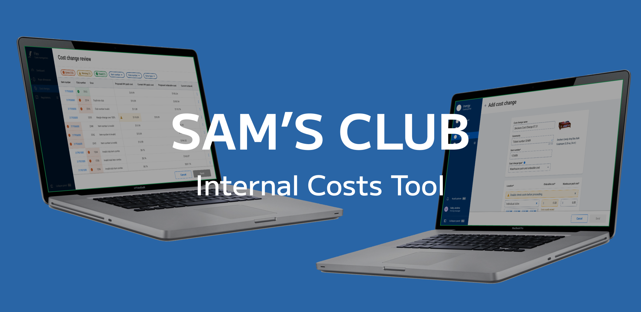
Overview
Sam’s Club
When I joined Sam’s Club they were undergoing a massive effort to update their internal tools. The team I worked on was the Costs Team. We worked on compiling all the different tools our internal team uses to make their work processes more efficient and to consolidate all the steps into a single platform.
My Role
At Sam’s Club I was the Senior UX Designer for their internal costs tool. I led the design for the new tool and conducted research with our users. I also led triage with engineering, product, and design to ensure the success of the project and that there was clear and open communication between the teams.
Research
It was essential in the development of the cost change platform to make sure we were on the right path in terms of usability and creating an intuitive product for our users. During my time at Sam’s Club I led the research we did for the product. As our users very busy, the time we had to test was limited. Usually we were able to schedule a monthly user test. The format was a combination of focus group and think aloud protocol. I would have users conduct a set of tasks while others watched and voiced their opinions. These tasks were followed by relevant questions, and at the end the PM and I would ask questions from a pre-agreed on list. This research was invaluable in helping us identify not only overall opinions on the current state of product but also real time user pain points.

Think Aloud Protocol conducted via Zoom using an interactive Figma prototype
Cost Change System
Costs is a tool that allows our internal users (know as merchants) to update the costs on items that Sam’s Club sells. Price changes can happen for a number of reasons including changes in shipping costs, changes in costs from suppliers, etc. There are two types of prices: orderable cost and warehouse pack cost. Orderable cost is the cost for a pallet of the item not including shipping or freight. Warehouse pack cost is the cost per unit including shipping and freight.
Updated Cost Change System
Originally users had to use a variety of tools and online apps to create and complete a cost change. The goal of this new platform was to consolidate these different steps into one platform, to create a better and more efficient experience for the users.
There are two different ways a user can initiate a cost change. Either by uploading an excel sheet or by manually entering the cost change through a logic based flow. For certain larger cost changes an excel document will be generated by another program that the user can upload into the system. For smaller cost changes, users usually receive information about the cost change via email. The manual cost change flow allows the users to quickly create a cost change without having to use an excel sheet.
Rules
East cost change has to be checked against rules to make sure it is valid. These rules can be divided into errors and warnings. Errors mean there is an issue that must be addressed, while warnings mean that the cost change value is either a mistake or an edge case. The errors are “invalid club number,” “invalid item number,” “invalid club/item combo” (the item is not stocked at the club), and “duplicate club/item combo.” The warnings are “cost change exceeds 100% margin” (meaning the cost change is greater than 100% change in margin) and “cost change is $0.00.”
Cost Change Pages
Dashboard page: This is the landing page for cost changes. On this page the user can see a table with all the previous cost changes and some key information about each of these cost changes. The user can navigate to the cost change report from this table. Users can start the process of adding a cost change through navigation on this page. When users upload a cost change the upload process takes place in a side panel on the dashboard page.
Cost Change Review page: Once the cost change has been uploaded the user is taken to this page if there are any rule violations in their cost change. On this page the user can edit any fields that have an error or warning. They can also delete any errors that they don’t want to fix and dismiss any warning for valid cost changes.
Manual Cost Change page: This page allows users to create single item cost changes. Users can target their cost changes towards locations groups (ie: Puerto Rico or Hawaii) or manually enter in the club numbers.

Report page: On this page users can see which cost change lines were successful or had errors. They are able to download a report on the cost change or download the cost change errors if they wish to make corrections and resubmit those cost change lines.

Cost Change Workflow
When I joined the costs team, the initial discovery had been completed, and there were some rough mocks of some of the pages. Based on this discovery, customer journey map had been made for the original larger scope pricing and costs user journey. This had been used to help inform the creation of the original mocks. At the beginning, the cost change platform was just three pages: the Dashboard, the Cost Change page and the Report page. The Cost Change page had options for both uploading and manually entering in a cost change. Even though this was a simple flow I wanted to map out the current user flows in this new platform to better understand how the user would interact with this platform and identify any potential pain points.
Original Cost Change Workflow
One thing that stood out to me was that when there were cost change lines rejected for rules violations, this led to a tedious process where the user would have to create a new cost change to deal with these issues, and they might even face further rejections from cost change violations. This also made it harder to track cost changes- what was originally one cost change could become two or more cost changes within the system. I wanted to explore a way to show users they issues before the cost change was submitted, or possibly even allow them to edit with the application itself.
Updated Cost Change Workflow
After discussions with product and engineering, we agreed that the very least we could have an intermediary page, showing users which lines contained rule violations. In this Cost Change Review page, the user would see a table with the errors and warnings in one tab and accepted cost change lines in another. The user had the option of pushing ahead with the submission, or downloading the excel sheet with all the issues highlighted, so they could edit that and resubmit. This addressed the issue of one cost change becoming multiple, as the users could identify errors before submitting the cost change and fix those. There was still an issues of potential tediousness for the user- in the case of rules violations having to download the sheet, make the edits in excel, and then reupload with the possibility of there being still further rule violations.
Another major change in the user journey was that based on user feedback and my heuristic, the upload flow and the manual entry flow had been separated. The user would access and initiate the upload through the dashboard, and the manual flow would be its own page.
Final Cost Change Workflow
Because the cost change review page in its initial state didn’t fully solve the issue of the users having to go back and forth between excel and the web app, I pushed expand the functionality of the table in the Cost Change Review page to include editing. I developed a prototype based on the previous page and with product came up with a preliminary PRD to outline the functionalities. After much discussion we were able to come to an agreement to have an editable table with some features such as bulk action items and draft state as post-PRD functions.
Thanks to this, the user no longer had to go back and forth between excel to make edits. Any rules violations could now be easily identified and fixed within the app.
Manual Cost Change
The manual cost change is flow that allows users to create a cost change for a single item entirely on the Sam’s Club Cost Platform. This prevents users from having to make an excel for these smaller cost changes. For this feature I was the sole UX designer.
Original
This is the first prototype developed prior to my joining of Sam’s Club. At this point the manual flow and upload flow were combined into one page. On the left side of the page was the manual cost change and on the right was the upload option. To better understand next steps and user pain points, I started with an heuristic analysis and user feedback sessions. Throughout the design process I utilised feedback from users, other designer, engineering, and product to improve the Cost Change platform.
Prototype created before I joined Sam’s Club
Final
Separating the manual and upload flows: Having these two types of cost changes on the same page was identified as a pain point in the initial heuristic evaluation and this was further reinforced in the first user tests conducted. Users thought they would have to both upload and fill out the information on the left side which was confusing them. Ultimately the upload step was moved to exist entirely within a side panel accessible from the dashboard, and this page was devoted to the manual cost change.
Layout Redesign: In the original layout all the fields were within one container. When the user creates a cost change, for all entries they are changing warehouse pack cost, orderable cost, or both. During user testing, I noted that users were confused about whether they had to fill out all fields even if they weren’t related to the type of cost change they were creating. Additionally, they worried about filling out the wrong cost field. I tested a few different layouts with our users to determine which layout coincided the most with their mental models, as well as implemented feedback I received from other designers. Ultimately, I divided the flow into sections: initial information, location/costs, and cost change dependent fields. The information sections included the item code and item image/description, but had three new fields: cost change type, cost change name, and description. The name and description were requested by users, and the cost change type was added so that only fields relevant to the cost change type were shown. The cost change dependent fields are warehouse pack reason code and orderable effective date.
Redesign of locations: To better understand the types of manual rule changes our merchants would be dealing with I asked for several samples of previous cost changes that had been made. When referencing these while performing the heuristic, I realized that with the original format, that because each club would be a separated entry, the page length could get very long. Also, it would be tedious for the user to individually enter each of these clubs and costs for each club. In addition, during our user testing users were under the impression that they had to fill out all of these fields. To address these issues, I simplified locations section so that the user would select one location group at a time. If they selected individual clubs, they could be able to group clubs by costs. One complication with this step is that certain types of locations can not be grouped together. This meant that the when the user added a new location there was logic to which locations would appear in the drop down. I mapped out the logic for these combinations for the engineering team.
Errors/Warnings: In the initial heuristic, I identified a lack of error handling/communication. Once we finalized the rules violations we could address in our MVP, I designed out the warning and error messages and styles for the fields, working closely with our content and ADA teams.
Copy: Throughout the iterations I worked with the content to update labels, drop down text, tool tip text, modal text, and error/warning text, to make sure language used was clear and consistent with the company brand.
Final design of the manual cost change page, featuring warnings.
This shows some of the logic in the location selections.
An example of an error message, also showcasing the early stages of the flow (before the user selects the cost change type).
Rules Checks
For this page one of the biggest challenges was working with engineering to determine which rules checks we could perform on this page. At this time, there was a simultaneous effort on another team to compile the costs information into a single database. However, in the current state several different API calls would have to make to perform the different checks. After many discussions, we settled on having the most basic checks (item number, clubs number, and cost change greater that $0) being run live (as opposed to after the user presses a validate button) , with the rest being slated for post-map when the databases were consolidated.


Cost Change Review
The Cost Change Review page, is where the user is able to make any changes to rules violations after uploading a cost change. When I was first brought on to Sam’s Club the Cost Change Review page was not a part of the user flow. Originally users would upload a cost change, and all instances that did not violate a rule would get pushed through, while all rule violations (even warnings) would get rejected and the user would have to fix and reupload these.
Original
The original version of this page, was an AG grid divided it into two tabs: “errors” and “updated,” so that all the cost changes with issues will appear in one section. Underneath the tabs I added the filters. One filter for warnings and one for errors, in addition to general filters for item number, club number, and error type. Within the AG grid on the left side I added action buttons: delete for errors, dismiss for warnings, and undo if any either delete or dismiss had been selected.
In this version, the original plan was that the user would either download this from this page or user this page as a guide to fix the excel sheet and then reupload. I led for discussions with engineering to push for an editable table so the use would not behave to potentially be constantly reuploading their cost change. These discussions backed with feedback from our user were successful in convincing engineering to create an editable table for our MVP.
I experimented with having expandable/collapsable cost change sections, grouped by item number to reduce the amount of scrolling the user might have to do. The results results of testing with our users, showed the preferred not having the collapsable sections, and would rather see all the cost change lines upfront. It also made it easier for them to compare cost change lines.
With collapsable sections
Without collapsable sections (chosen)
FINAL
Making the Table Interactive: Ultimately the decision of whether or not to make the table interactive, so that users could edit the table in real time, hinged upon whether it would provide enough value to users given the effort on engineerings behalf to implement this. To better understand what these uploaded cost changes would look like as well as the amount of errors they could generate, I had some of the merchants send me the cost changes they submitted as well as the list of cost change lines that were rejected for rules violations. I also did a video call with one the merchants to watch how they currently preformed the cost change and dealt with any issues that arose. Although most cost changes did not have issues, when there were issues the majority of their effort would be spent on fixing these cost changes. Also the larger the document, the more likely there were to be more issues. They would constantly be going back and forth between the previous site and the excel sheet for the cost change. Based on these findings, the Product Manager agreed that it would be important to implement an interactive table. We came up with a list of requirements and use cases, as well as a rough mock of the various interactions and layout of the table, and presented this to engineering. Ultimately we were able to get them to agree to almost all the features, except draft state and bulk action items which were pushed to post MVP. In subsequent testing with our users, they commented on how much more easy it was to do all the edits in-app.
Actions Column: The actions columns was added for the interactive table as a way to provide users with functionality beyond simply editing the fields. Originally, engineering asked we limit the actions to one per a line for MVP and we decided on delete for errors, dismiss for warnings, and undo for any lines that had been edited. For the first iteration, these actions were text button with colors dependent if they were related to warning or errors. The actions were placed on the right side to keep consistent with the dashboard. Followup from engineering, let us know that they could easily implement more action items. We tested three versions of the actions bar with users (single action with icon, multiple actions with icon, and multiple action with kebab menu) and found users preferred the multiple actions with icons.
Table Layout: In the final design for the table, I made the left columns of item number, club number, and errors as well as the right side action bar fixed. I noted in usability testing that these were the columns that users would consistently be referencing, so I wanted to keep them consistently with the user view.
Components: As the interactive table and drop down filters were new components I had to work closely with the design system and ADA teams to makes sure these components aligned with the style of our design system and ADA compliance guidelines. I also had to make sure all states were accounted for: rest, active, hover, etc; as well as having the format of interaction documented.
Focusing: I removed the access to the side navigation and removed the cost change details (report number, name, and description) from above the table, to distinguish this page visually from the Cost Change Review. This served to limit distracting elements on the page and focus the user solely on fixing any issues with the cost change. In that same vein, I also removed the tabs and only showed errors/warnings.
Final Cost Change Review page

User hovering and editing on Cost Change Review page

Original action bar with the different explorations. Third from left was the final selection.

Filter states
Next Steps
Two of the next steps are the desired table features that were put in the backlog, for post-MVP implementation. The first of these was implementing a draft state- meaning that the user would be able to upload a cost change and then return anytime to address rules violations before submitting. In the current state, the user must immediately address any errors or warnings before submitting the cost change. The other feature was bulk action items: currently the user performs actions on cost change lines one at a time, but with bulk action items they would be able to mass select these lines and perform actions on them.
Finally, in the current state the user has to upload the excel document when it is generated in another program. However, in the future the goal is to automatically send these sheets to the cost change platform so that the user does not have to download and then upload the documents.


Cost Change Report
When the user clicks into a cost change report from the dashboard they are taken to the cost change report page. On this page they can see the failed and accepted cost changes. They can download a report or a spreadsheet to fix any cost changes that failed.
Original
This version was the original cost change report page when I joined the cost change team. The original page had information on the item including an image, and information specific to the cost change. The table is divided into woo tabs: exceptions and updated. Exceptions are cost changes that didn’t go through due to rules violations. Updated are the cost changes that did go through.
FInal
Header Layout: I simplified the header layout to take into account differences across different types of cost change reports. The image was removed to allow for more of the table to be viewed in one screen, and to account for cost changes that would cover multiple items. Additionally the name of the cost change and comments were made editable. Finally, the action items were also consolidated into a single button with a drop down.
Table Layout: Filters were added to allow for users to filter entries by item, club, or errors when appropriate. A download button for the WROB and Errors report was also added. The copy and icon were updated for the errors tab and the tab was updated to align with the design of the cost change review page. For the updated tab I rearranged the columns and added in new columns to highlight cost changes based on user feedback and set item number and club number columns as sticky. I tested two different versions: one with the values stacked (bottom), and one with all values in line (top). I found that users preferred the in line set up because it allowed the to compare costs between different items more easily.
In-line version

Stacked version