Overview
MY ROLE
While at Walmart Connect I worked as the design lead for their new self-serve advertising platform. My role was to iterate on existing mocks, design new features that users would expect/need, and to collect feedback from both our internal teams and our external advertisers. During my time at Walmart I also led initiatives to restructure how we conducted research and organized feedback.
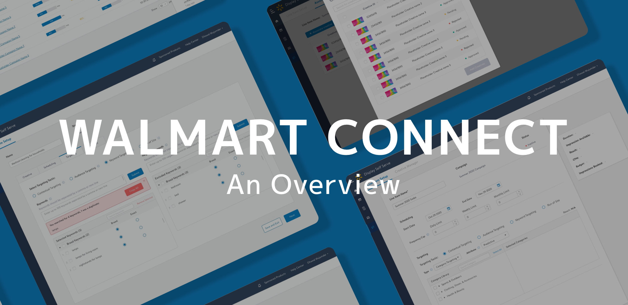
Walmart Connect
Walmart Connect (formerly known as Walmart Media Group) is the advertising branch of the Walmart company. When I joined Walmart Connect, they had just started developing their latest product: Display Self Serve (DSS). Prior to this, advertisers could not autonomously set up ads on walmart.com and instead had to work with our sales team to set up their ads. Through DSS, we were enabling users to set up their own campaigns and have hands-on control over the flighting and optimization of their campaigns. Additionally, this platform allowed users to easily create their own ad designs.

What makes an ad
Everyone knows what an ad is, but most people probably don’t understand the complex hierarchy and settings that go into creating an ad. Because advertising is a complex world with lots of unique terminology and structures, that can even differ platform to platform, I wanted to provide some background information that would make this more understandable.
Components
Campaign: Campaigns are the highest component in the advertising hierarchy- they include groups of line items. They are normally used to set goals for advertising campaign. Some common types of campaigns are based around events (super bowl, back to school), holidays/seasons (Halloween, Spring), new products, and sales. To promote relate products
Line Item: Line items are where the user will set the duration, targeting options, and budget of the campaign. Normally within a campaign the user will create different line items and to try different types of “attacks” and based on what performs best will add or detract budget from different line items.
Creatives: A creative is the set of visual ads the user sees. The individual ads will differ by size and where they appear on the site, but within a creative the ads will have a consistent theme. Ads on walmart.com consist of text, images, and CTA’s. These are associated at the line item level, but can be recycled and used on different line items within or even outside the same campaign.

Hierarchy of campaigns, line items, and creatives. Note creatives can be shared across campaigns/line items, but all other elements must be unique.
DSS
Users
The users of DSS would be any company that sells products through walmart.com. Internally we refer to these companies that create ads as advertisers. Within an advertiser there will be different types of users depending on the division of labor within the company. Depending on the company there can be separate users for creating campaigns/line items versus creatives. Additionally, many large corporations will contract out their marketing work to agencies, sometimes even having a different agency for each part.

Platform
The Display Self Serve (DSS) platform consisted of a dashboard and three main user flows. The dashboard shows the hierarchy of campaigns, line items within campaigns, and the creatives associated with each line item. It also shows some of the most important statistics around campaigns and line items: dates, budget/impressions (advertisement views) delivered, and pacing (is the correct number on impressions being delivered each day). The three flows are the campaign creation flow, the line item creation flow, and the creative creation flow otherwise known as the Creative Builder.

First Steps
My first task when joining Walmart Connect was to familiarize myself with the platform, the terminology, and the structure of advertisements on Walmart. After I gained an understanding of what was needed to create a walmart.com ad on our self-serve platform I performed a Visual Quality Analysis (VQA), Walmart’s version of an heuristic evaluation. I thoroughly investigated the platform and also compared it to the mocks to note visual, copy, and UX issues as well as bugs.
Additionally I performed some initial walkthroughs with users of our sister internal product. From this, I was able to lay a foundation for understanding the typical workflow of the user, as well as getting feedback about worked and didn’t work based on this workflow. At this time we began prepping for the different phases of our release of DSS.
Design Process
When I joined Walmart Connect they were preparing for the launch of DSS. The plan was to have two internal tests, followed by an external demo, an alpha release, and a beta release, before finally releasing to general audiences. For each of these phases my process was as follows:

Design process at Walmart Connect
QA Testing: Before any user testing, myself and the product team would test the product to find most bugs and test common and edge use cases. I would additionally, prior to the general QA testing, perform a VQA to make sure the site matched the approved mocks.
User testing: It was very important to me that we not only collect feedback but conducted user studies. I would conduct Think Aloud Protocol (TAP) with select users to watch them interact with the platform to identify any pain points. Additionally I would work with PM’s to lead focus groups to collect feedback at the different stages of the campaign creation.
Synthesizing of Feedback: I would look for patterns from the pain points noted in the TAP sessions to identify UX issues. Additionally I would collect all the feedback (across all sessions) into an excel document organized by flow/page and issue type (visual, UX, copy, feature request, bug). I would also track which users would request which changes, which was especially important when advocating for a new feature or a UX redesign.
Discussion of Next Steps: At this time the product team, engineering, and myself would discuss what initiatives would be put forward for the next release. This was heavily based on the feedback log I created.
Design and Iteration: After going over feedback and deciding what the next design changes and features would be, I would create the new designs first sketching them out and then building them out using our style guide and component library. I would iterate on these with the feedback from PM’s, engineering, and designers on other teams.
New Features
Throughout my time working on DSS, I contributed heavily to the product by designing new features as needed. The need and prioritization of these features was backed up by the research we had done with users. For each feature, I worked extensively with engineering and product to make sure that the specs and workflow were clear and that the feature was ultimately worked as it was supposed to.
Keyword Targeting for external users
Keyword Targeting
Problem: One of the most common types of targeting that our users expected to be able to utilize on DSS was keyword targeting. This was type of targeting allowed users to target ads by search keywords. However, for our first iterations had only the most simple targeting options. Some issues to consider are that users can input hundred of keywords, and assign a match type to each keyword (broad or exact). Also, there are some keywords advertisers might not be able to target.

Keyword targeting for internal technicians
Solution: I designed a keyword targeting tool that allowed users to add target keywords and negative keywords. The tool allows users to put in 100-200 keywords at a time, and do bulk actions so save users time. I also designed an internal tool that allows our operations team to reject or approve these keywords, and well as add their own. Some important features include collapsible sections for groups of keywords, to make finding keywords easy, keywords search, and error messages for different keyword submittal issues.
Macro Contextual Targeting
Version A: simpler functionality, more straightforward
Problem: With the pre-existing contextual targeting feature, advertisers were having issues meeting their impressions quota. They also wanted recommendations for categories to target. On the Walmart side, we wanted to incorporate a tool that our internal technicians used, which used ML to expand to related categories. However, the tool was very complex and took specialized training to use and we wanted to translate this into something intuitive and non-expert friendly.
Version B: more advanced, greater user control
Solution: I looked into our existing internal tool to see how it works and developed two different prototypes with differing levels of user control and complexity. We then A/B tested the two version for user comprehension and preference. We found that all advertisers we tested with not only understood the functionality of the more advanced version but also preferred the level of control. The final version allowed the user to turn on the related categories and select the reach they wanted.
Audience Targeting
Category Targeting view of Audience Targeting
Problem: Another type of targeting, that we originally did not offer, but that was also important to our advertisers was audience targeting. Audience targeting allows our users to target groups of customers based on certain characteristics. Because of the engineering heavy work this type of targeting would require we needed to start with an MVP version before working our way up to the full scope of audience targeting.
Brand Targeting view of Audience Targeting
Solution: Based on advertiser feedback we picked the initial options for audience targeting which were a primary selection if they wanted to target customers by their brands or by category, and a secondary selection between likelihood of purchasing versus purchase history. We also added in custom audiences which advertisers could request very specific parameters and have that specific audience made for them to address the advertiser need for more complex options.
Tags/CTA’s/3P Impressions
Where the user adds CTA links, and different third party trackers
Problem: Advertisers to use third-party companies to get metrics about the performance of their ads. Walmart does have their own reporting center, but some companies prefer to view these metrics from a neutral third party. One issues I had to consider is that advertisers could potentially use different url's for each ad within a creative, or use the same url's throughout the creative. Also, all url's had to be checked by different API's to make suer they were correct/not malicious. Not only could these API's take up to 15 minutes to return a result but custom warnings had to be given to the users based on which API call the url failed. Additionally, this feature was originally slated to be a part of the creative builder, didn't make sense from a UX perspective as it was most likely different users would be doing these different tasks, and that these would be tasks done at different times of the advertisement setup.
Solution: I used advertiser an internal feedback to advocate for a move of the feature from the creative builder to our line item setup flow. I designed the page for third-party urls to include warnings that would let the user know if there were any issues.
Notification Center
The notifications panel
Problem: There are several issues that can delay or cause issues when serving ads. Right now there is no in app way to communicate these to our advertisers, and we rely solely on email. However, these emails can get lost in a sea of other emails users receive, and it is important to communicate these issues through the platform itself.
Solution: I designed a notification center that allows the user to view all the notifications they receive. Notifications that will negatively affect the flighting of a campaign are labeled with a warning symbol, so the user can quickly pick out the most urgent notifications. Additionally new alerts are labeled with "NEW" and bolded. Users can chose to delete notifications and turn on/off email notifications.
Redesigns
In addition to designing several new features I also led several redesigns of different flows in DSS. Based on the different UX issues I noticed in my own analysis and in feedback from our various users, I pushed for engineering resources to tackle these issues and to create a more intuitive and efficient user experience.
Line Item Setup
The budget tab of the original Line Item Page
Problem: In the original version of the Line Item Setup users had to switch between tabs to adjust different groups of settings. This could be especially tedious when the advertisers were looking for a certain CPM or number of impressions to reach, because they had to constantly switch back and forth between tabs. Also, the tool used to set the budget was confusing and hard to use to set precise or small budgets.
The redesigned Line Item Page
Solution: For the single page setup I designed, users were were able to simply scroll up and down through the different sections to update their choices (without having to switch between tabs). Additionally, in a floating box that would follow the user as they scrolled, they could see the most important values. These values we showed user were based on both internal and external feedback we received. For the budget section, I removed the slider entirely and just made it a simple number field. The single page redesign was universally well received. We showed this redesign to advertisers, before implementing it, and received universal approval.
Item/Brand Set Collection
The original Item/Brand Set Collection Page
Problem: The item/brand set collection allows advertisers to select brands or items to collect data on. In the original version, the process to select items or brands was convoluted and unclear. Another major pain point was that users could only search by keywords in item names, which was an issue as item names could be hundred of characters long. This feature was identified by our test partner advertisers as the most painful part of the platform.
The redesigned Item/Brand Set Collection Page
Solution: I redesigned this feature by separating out the item and brand selection (through a radio button). Additionally, the new feature allowed users to search by 100's of item numbers, expediting the process of finding the items they wanted to collect data on. Finally, I incorporated error messages in the case that there was an issue with the item numbers entered by the user.
Campaigns Page
Original Campaigns Page
Problem: The first version of this page showed the hierarchy of line items and campaigns, the duration as a bar graph, number of line items within a campaign, and pacing. We got feedback from users that seeing duration as a bar graph was confusing and that they would rather see dates. Additionally, the most important information they wanted to see upfront was the budget and impressions.
Redesigned Campaigns page
Solution: In the new design, I made the changes requested by our users: changing duration to a date, and adding in the budget and impression bar graphs. I also removed the number of line items, and changed how we presented pacing to a way that would make more sense to the user. Another issue users had complained about was that they found it hard to navigate to the creatives/creative builder so I added creatives into the campaign page hierarchy.
Projects outside of DSS
Not only was I the design lead for DSS, but I also picked up several projects for other teams lacking designers.
Other Projects
Walmart Advertising Page: I updated the flow for feedback collection from advertisers to make it more user friendly and intuitive. Additionally I designed a feedback module to collect feedback on individual support cases. Prior to this the team was collecting feedback via email and only had a 2% response rate.
Rule-Based Optimization: I worked with engineering and product to build out the entire flow for this feature which allowed users to make automatic optimizations to their campaigns if certain conditions were fulfilled.
Custom Reports Redesign: In another platform we create custom reports based on certain criteria the users selects. I redesigned this to be more cohesive with the rest of the platform design wise, and to include some new fields.
Reporting Center Customization: I began the work on allowing user to create a customized report center, allowing them to view, hide, and move widgets with metrics.
My Initiatives
Besides advocating for and initiating redesigns on several pages, I also worked to improved the overall processes for design at Walmart Connect. When I first joined, I noticed there was a lot lacking in terms of structure. There was no set research methods, no feedback log, and no attempt to better understand and profile the advertisers we were working with. I worked with my team to change this, to ensure that our testers contributions were to be fully utilized to create a superior product.
Research
Before I had joined, my team had conducted some minimal internal research. However there was no set system to how this research was conducted. I implemented a research structure that involved Think Aloud Protocol (TAP) user testing, focus groups, and a final survey. During TAP, I would watch as many users as possible use the tool for the first time while thinking aloud, with some loose tasks to guide them. I would make notes of places where they were confused, pain points they would encounter, etc. This gave us an idea of smaller issues that users might not remember. Also, if users ran into bugs we would also be able to troubleshoot live.
FEEDBACK COLLECTION
Organized and annotated survey results
The initial research conducted at Walmart Connect, had not been organized or stored in a singular file. I created our overarching DSS backlog. I organized the feedback by flow/page, issue type (bug, copy, visual, feature, ux), and users/session. Additionally I also created two pages, one for current issues and another for resolved. This feedback log was essential in helping our team prioritize new features, fixes, and redesigns.
COMPANY PROFILES
I thought it was very important that we understood our companies on an individual level as well as well as in terms of personas. I created a document to note important aspects of each company we worked with including: did they use agency, preferred targeting tactics, types of campaigns (seasonal, year long, sale, etc), whether they used tags/trackers, etc. This helped us better understand how each company operated as well as note some themes especially along differences in company size.
KPI Metrics
Another practice I started at Walmart Connect was the collections and measurement of KPI’s. The KPI’s I used to define the success of the product were Net Promoter Score (NPS), usability rating, overall rating (functionalities/features), and how the product compares to our competitors. These ratings were collected through the surveys collected at each round. These scores were helpful for our team to benchmark the progress of the project.
Learnings
My time at Walmart has been invaluable in helping me grow as a designer. Not only did I learn a lot about the field of advertising and working in a B2B environment, I also learned a lot about design.
I encountered a lot of complex situations which I did not have previous experience with such as: hierarchical lists, dealing with long API response times (up to 15 mins), and complex workflows. I did research on how other sites would approach these issues and UX best practices for similar situations. Ultimately, my approach was proven through user feedback both explicit and implicit. I also worked to create better workflows for when a field was required before the user could interact with anything else.
I also learned a lot about advocating for design as well as trying to find a balance between new features and redesigns. For DSS, especially because it was a brand new product for Walmart Connect, it was a constant struggle when choosing to invest engineering time in new features vs UX redesigns. As we got more feedback from advertisers we discovered that we needed to expand our targeting options especially to cover a wide range of advertiser needs. Especially as the self-serve experience had been well established at other companies Walmart had a lot of catching up to do. This is where the feedback log that I had created became essential. Based on the LOE on engineering and the measurable demand from users we are able to prioritize all the different requests.